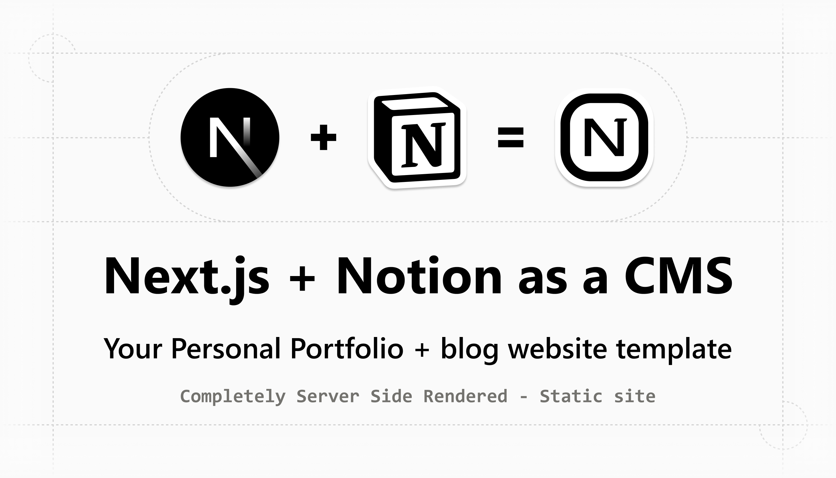
πŸ› οΈ This template is currently in progress!

I'm building this Notion as a CMS portfolio + blog template in public.

Follow my daily updates on X and Bluesky.

a portfolio website with a blog, built using Next.js with Notion as the CMS

manage all your content (pages, blogs, metadata) directly from your Notion app.

πŸš€ Launching soon, you'll be able to buy this template and use it for your own portfolio & blog.

❀️ Interested in buying this template? Message me on X or Bluesky.


Rich text

Text πŸ“

Bold, Italicize, Underline, Link, code , break, s p a c i ng,

Color Text

Default, Gray, Brown, Orange, Yellow, Green, Blue, Purple, Pink, Red.

Background Text

Default, Gray, Brown, Orange, Yellow, Green, Blue, Purple, Pink, Red.


This link navigates to the Notion website

( These are standard external links added in Notion to point to websites outside your domain. On our website, they open in a new tab. )

This link navigates to the blog page

( These are internal links created in Notion to point to other pages within your website. They open in the same tab for faster navigation. To create an internal link in Notion, use a direct path like /blog β€” don’t include the full domain. The path must match an existing page on your site for it to be recognized and rendered correctly. )

Default, Gray, Brown, Orange, Yellow, Green, Blue, Purple, Pink, Red.

Default, Gray, Brown, Orange, Yellow, Green, Blue, Purple, Pink, Red.


Underline βž–

Normal Underline

Underline

Color Underline

Default, Gray, Brown, Orange, Yellow, Green, Blue, Purple, Pink, Red.

( You can see here ☝🏻 that the underline color is inherited from the text color. )

Background Underline

Default, Gray, Brown, Orange, Yellow, Green, Blue, Purple, Pink, Red.


Strikethrough 〰️

Normal Strikethrough

Strikethrough

Color Strikethrough

Default, Gray, Brown, Orange, Yellow, Green, Blue, Purple, Pink, Red.

( You can see here ☝🏻 that the Strikethrough color is inherited from the text color. )

Background Strikethrough

Default, Gray, Brown, Orange, Yellow, Green, Blue, Purple, Pink, Red.


Inline Code

Default inline Code

inline code

Color text inline Code

Default, Gray, Brown, Orange, Yellow, Green, Blue, Purple, Pink, Red.

Background inline Code

Default, Gray, Brown, Orange, Yellow, Green, Blue, Purple, Pink, Red.

Different Backgrounds Code side by side

Yellow Green Blue

Default Gray Brown Orange Yellow Green Blue Purple Pink Red.

Different Text Colors inline inline Code side by side

Yellow Green Blue

Default Gray Brown Orange Yellow Green Blue Purple Pink Red

inline code with Bold

Bold

inline code with Italicize

Italicize

inline code with Underline

Default, Gray, Brown, Orange, Yellow, Green, Blue, Purple,Pink, Red

inline code with Strike Through

Default, Gray, Brown, Orange, Yellow, Green, Blue, Purple,Pink, Red

Link

inline code with Emoji inside

const status = "βœ… Success";

console.log("🐞 Debug mode enabled");

const emoji = "🧠 + πŸ’» = πŸ€–";

mix inline code with all annotations

Notion as a CMS


Text inline Equation

E=mc2E = mcΒ²

F=maF = ma

F=Gβˆ—(m1βˆ—m2)/r2F = G * (m₁ * mβ‚‚) / rΒ²


Emojis in Text

All emojis in text are rendered as Twemojis for consistent appearance across devices.

πŸ˜„ πŸŽ‰ ❀️ πŸ”₯ πŸ€” πŸš€ ✨ 🐱 🧠 🌍 πŸ’» 🧑 😎 πŸ“š πŸ™Œ πŸ• 🐢 πŸ–€

People with Skin Tone Variations

πŸ‘πŸ» πŸ‘πŸΌ πŸ‘πŸ½ πŸ‘πŸΎ πŸ‘πŸΏ

πŸ™πŸ» πŸ™πŸΌ πŸ™πŸ½ πŸ™πŸΎ πŸ™πŸΏ

πŸ‘πŸ» πŸ‘πŸΌ πŸ‘πŸ½ πŸ‘πŸΎ πŸ‘πŸΏ

πŸ‘‹πŸ» πŸ‘‹πŸΌ πŸ‘‹πŸ½ πŸ‘‹πŸΎ πŸ‘‹πŸΏ

Gendered Professions

πŸ‘¨β€πŸ’» πŸ‘©β€πŸ’» πŸ§‘β€πŸ’» Β  // Developer

πŸ‘¨β€πŸš€ πŸ‘©β€πŸš€ πŸ§‘β€πŸš€ Β  // Astronaut

πŸ‘¨β€πŸŽ¨ πŸ‘©β€πŸŽ¨ πŸ§‘β€πŸŽ¨ Β  // Artist

🀯 πŸ’€ 🀑 πŸ‘€ πŸ₯Ί 😭 πŸ€– πŸ˜΅β€πŸ’« 🫢 🫠 πŸ«₯

Aesthetic Emojis for UI

✨ 🌸 🌈 🌻 πŸͺ© πŸ§ƒ 🌟 πŸŒ™ πŸŒ€ πŸ’«

People with Skin Tone Variations

πŸ‘πŸ» πŸ‘πŸΌ πŸ‘πŸ½ πŸ‘πŸΎ πŸ‘πŸΏ

πŸ™πŸ» πŸ™πŸΌ πŸ™πŸ½ πŸ™πŸΎ πŸ™πŸΏ

πŸ‘πŸ» πŸ‘πŸΌ πŸ‘πŸ½ πŸ‘πŸΎ πŸ‘πŸΏ

πŸ‘‹πŸ» πŸ‘‹πŸΌ πŸ‘‹πŸ½ πŸ‘‹πŸΎ πŸ‘‹πŸΏ

πŸ”¨

Rich Text Rendering – How It Works

All text customizations are rendered with semantic HTML in mind. The structure is intentionally minimal, no unnecessary <span> or <div> clutter. Links are rendered using the <a> tag, and code snippets use the <code> tag for proper semantics and accessibility.

(Everything is styled to closely match the look and feel of a Notion page.)

External links are rendered using the <a> tag with target="_blank" and rel="noopener noreferrer" attributes.

This ensures secure navigation by opening the link in a new tab without allowing the new page to access or control your original site, protecting it from potential security risks like tab-napping.

Internal links are rendered using Next.js’s Link component. This enables fast, client-side navigation with performance benefits, when you hover over these links, Next.js begins preloading the destination page in the background.

Inline equation

You can add inline equations in Notion using LaTeX syntax β€” and we support this feature as well.

Inline equations are rendered using KaTeX, just like in Notion, for fast and accurate math rendering directly inside text.

Twemoji

You may notice that these emojis look slightly different from the default system emojis.

That’s because we convert them into Twemojis, the open-source emoji set from 𝕏 (formerly Twitter), designed for consistency across platforms.

We achieve this by parsing and replacing native emojis using the twemoji-parser package.

This makes the emoji rendering uniform across all browsers and devices, matching Notion’s emoji styling more closely.

Rich Text Support

Rich text styling is supported anywhere text appears, inside paragraph blocks, headings, list items, callouts, block captions, and all notion blocks.

This includes bold, italic, code, links, text color, and background color.

Rich Text Styling Behavior

In Notion, you can apply both a color and a background to rich text, but the Notion API only returns one at a time, either a color or a background. So, in this template, we replicate that limitation and render only one.

Some Notion blocks (like paragraphs, headings, callouts, etc.) also allow applying a text color or background color to the entire block. Just like with rich text, we apply only one style to the block, either color or background.

You can still customize individual text inside the block with its own color or background, separate from the block’s styling.

This means a block can have a background, and specific words inside it can have their own rich text styling, just like in Notion.


Basic Blocks

Paragraph Block

Color Paragraph block

default color

gray color

brown color

orange color

yellow color

green color

blue color

purple color

pink color

red color

Background Paragraph block

default background

gray background

brown background

orange background

yellow background

green background

blue background

purple background

red background

pink background

Paragraph block with all text customizations

Lorem ipsum dolor sit, Emojis πŸ“’ πŸ“πŸ“šπŸͺΆπŸ“œπŸŒ•Φ΄ΦΆΦΈβ˜Ύβ™‘πŸ’―πŸš€πŸŽ― πŸ‘‹πŸ» using https://github.com/jdecked/twemoji-parser🐦, Bold, Italicize, Underline, My Portfolio link, Code, Break, S p a c i n g. Equations: F=(Gβˆ—m1βˆ—m2)/d2F = (G * m1 * m2) / d^2 blue color blue background Link site page referring link πŸ“…Β World Emoji Day πŸ“…Β World Emoji Day F=(Gβˆ—m1βˆ—m2)/d2F = (G * m1 * m2) / d^2 yooo hie lal a alsd v asdh code1code2 yo

πŸ”¨

Paragraph Block – How It Works

The text (paragraph) block is rendered using the <p> HTML tag.

You can apply either a text color or a background color to the entire block.

In Notion, paragraph blocks do not support nested blocks, so this behavior is replicated here as well.

If a paragraph block is empty in your Notion page, we still render it.

This allows you to intentionally create spacing between blocks, just like you can in Notion.


Heading Blocks

Heading 1

Heading 2

Heading 3

Color Heading 1/2/3 block

Heading 1 block with color blue color blue background

πŸ‘†πŸ»You can see above even if a block has a background or color, any text inside it that has its own background or color still shows up just like in Notion. This works thanks to the RichText component.

Heading 2 block with color

Heading 3 block with color

(like paragraph you can give all colors to any heading 1/2/3 blocks)

Background Heading 1/2/3 block

Heading 1 block with background blue color blue background

Heading 2 block with background

Heading 3 block with background

(like paragraph you can give all colors to any heading 1/2/3 blocks)

Heading blocks with all text customizations

πŸ”¨

Heading Blocks – How It Works

Heading blocks (1, 2, and 3) are rendered using the <h2>, <h3>, and <h4> HTML tags.

We skip <h1> for Heading 1 because <h1> is reserved for the page title, maintaining proper document structure and SEO best practices.

You can apply either a text color or a background color to the entire heading block.

If a heading block is empty in your Notion page (i.e., contains no text), we do not render it.

In Notion, if you insert another block inside a heading block (making it a nested), Notion automatically converts it into a heading toggle block.

We support this behavior as well.


Bulleted list Block

Background Bulleted list block

  • default color
    • gray color
      • brown color
        • orange color
          • yellow color
            • green color
              • blue color
                • purple color
                  • pink color
                    • red color

Background Bulleted list block

  • default background
    • gray background
      • brown background
        • orange background
          • yellow background
            • green background
              • blue background
                • purple background
                  • pink background
                    • red background

Normal bulleted list example

  • Boil fresh water
  • Add coffee grounds to your filter or French press
  • Pour hot water over the coffee
  • Let it brew (about 4 minutes for French press)
  • Press or filter the coffee
  • Pour into your favorite mug β˜•
  • Add milk or sugar if desired
  • Enjoy your coffee break! 😌

πŸ“Œ

Bulleted List Block – How It Works

Each bulleted list item is rendered using the <li> HTML tag.

We’ve added a custom feature where adjacent bulleted list items are grouped and wrapped inside a <ul> element for proper HTML semantics.

By default, the Notion API does not return list items as grouped blocks, so we manually detect and group them to maintain structure.

You can apply either a text color or a background color to the entire bulleted list block.

In Notion, you can nest any block inside a list item β€” we replicate this behavior exactly.

As you nest bulleted list blocks inside one another, the bullet point style automatically adjusts based on the nesting level.

In Notion, the bullets cycle through disc, circle, and square depending on the depth β€” we replicate this behavior as well.

If a Bulleted List block is empty in your Notion page (i.e., contains no text), we do not render it.


Numbered list Block

Background Numbered list block

  1. 1.
    default color
  2. 2.
    gray color
  3. 3.
    brown color
    1. 1.
      orange color
    2. 2.
      yellow color
    3. 3.
      green color
      1. 1.
        blue color
      2. 2.
        purple color
      3. 3.
        pink color
      4. 4.
        red color

Background Numbered list block

  1. 1.
    default background
  2. 2.
    gray background
    1. 1.
      brown background
    2. 2.
      orange background
      1. 1.
        yellow background
      2. 2.
        green background
  3. 3.
    blue background
    1. 1.
      purple background
    2. 2.
      pink background
  4. 4.
    red background

Normal Numbered list example

  1. 1.
    Boil fresh water
  2. 2.
    Add coffee grounds to your filter or French press
  3. 3.
    Pour hot water over the coffee
  4. 4.
    Let it brew (about 4 minutes for French press)
  5. 5.
    Press or filter the coffee
  6. 6.
    Pour into your favorite mug β˜•
  7. 7.
    Add milk or sugar if desired
  8. 8.
    Enjoy your coffee break! 😌

πŸ“Œ

Numbered List Block – How It Works

Each numbered list item is rendered using the <li> HTML tag.

We’ve added a custom feature where adjacent numbered list items are grouped and wrapped inside an <ol> element for proper HTML semantics.

By default, the Notion API does not return list items as grouped blocks, so we manually detect and group them to preserve the correct structure.

You can apply either a text color or a background color to the entire numbered list block.

In Notion, you can nest any block inside a list item β€” we replicate this behavior as well.

As you nest numbered list blocks inside one another, the numbering style automatically adjusts based on the nesting level.

In Notion, the styles cycle through numbers, letters, and Roman numerals, depending on the depth β€” we replicate this behavior too.

If a Numbered List block is empty in your Notion page (i.e., contains no text), we do not render it.


To-do Block

To-do item (unchecked)

To-do item (checked)

color to do (checked todo text will not have block color but you can add text color by selecting individual text like this also strike through color can be change like this)

background to do (checked)

unchecked

color to do (unchecked)

background to do (unchecked) (showing nested blocks)

This is a paragraph inside an unchecked to-do.

  • Bulleted list item
  • Hi
  1. 1.
    Numbered item
  2. 2.
    Hi

Color To-do block

default color

gray color

brown color

orange color

yellow color

green color

blue color

purple color

pink color

red color

Background To-do block

default background

gray background

brown background

orange background

yellow background

green background

blue background

purple background

red background

pink background

To-do block with all text customizations

Lorem ipsum dolor sit, Emojis πŸ“’ πŸ“πŸ“šπŸͺΆπŸ“œπŸŒ•Φ΄ΦΆΦΈβ˜Ύβ™‘πŸ’―πŸš€πŸŽ― πŸ‘‹πŸ» using https://github.com/jdecked/twemoji-parser🐦, Bold, Italicize, Underline, My Portfolio link, Code, Break, S p a c i n g. Equations: F=(Gβˆ—m1βˆ—m2)/d2F = (G * m1 * m2) / d^2 blue color blue background Link site page referring link πŸ“…Β World Emoji Day πŸ“…Β World Emoji Day F=(Gβˆ—m1βˆ—m2)/d2F = (G * m1 * m2) / d^2 yooo hie lal a alsd v asdh code1code2 yo

πŸ”¨

To-do Block – How It Works

The To-do block is rendered using an <input type="checkbox"> along with a <p> tag for the text content.

We include a semantic checkbox input for accessibility, marked as readOnly and visually hidden to match Notion’s behavior.

In Notion, the To-do block does not use a standard HTML checkbox. Instead, it renders the checked and unchecked states using custom SVG icons β€” we replicate this behavior for a exact look.

You can apply either a text color or a background color to the entire block.

Just like in Notion, you can nest any block inside a To-do block, and we also able to render that as well.

If a To-do block is empty in your Notion page (i.e., it contains no text), we do not render it.


Toggle Block

Toggle block

hi share this template

Toggle block with no nested blocks ( Appears with a faded toggle icon )

Toggle Block with Background

If a background is applied to the toggle block, all nested blocks will inherit that background, unless a specific background is set on a nested block or rich text.

Toggle Block with Color

Similarly, if a color is applied to the toggle block, all nested content will inherit that color β€” unless a nested block or text span has its own color applied.

Color Toggle block

default color

gray color

brown color

orange color

yellow color

green color

blue color

purple color

pink color

red color

Background Toggle block

default background

hi

gray background

brown background

orange background

yellow background

green background

blue background

purple background

red background

pink background

πŸ”¨

Toggle Block – How It Works

The Toggle block is rendered using the native <details> and <summary> HTML tags, along with a <p> tag for the toggle text β€” providing clean and semantic HTML.

In Notion, a Toggle block behaves similarly to a paragraph block, but it allows nesting any other Notion block inside it.

By default, nested blocks are collapsed and hidden. In Notion, you expand them by clicking the small triangle icon on the right.

We replicate this behavior, but with an improvement β€” the entire toggle block is clickable, not just the icon. Clicking anywhere on the toggle block will open or close it, and the whole block uses a pointer cursor to indicate interactivity.

If a Toggle block is empty in your Notion page (i.e., it contains no text), we do not render it β€” even if it has nested blocks inside.


Page Block

not supported


Callout Block

Color Callout block

πŸ’‘

Default text

πŸ’‘

Gray text

☝🏻

Brown text

πŸ‘ŒπŸ»

Orange text

πŸ”‘

Yellow text

🚧

Green text

⚠️

Blue text

πŸ”₯

Purple text

πŸ“Œ

Pink text

βœ‚οΈ

Red Text

Background Callout block

πŸ’‘

Default

πŸ‘ŒπŸ»

Gray

☝🏻

Brown

🚧

Orange

βœ‚οΈ

Yellow

πŸ”‘

Green

πŸ‘‰πŸ»

Blue

πŸ”₯

Purple

⚠️

Pink

πŸ“Œ

Red

Callout Block without Icon

Callout Block with nested blocks including callout text

Callout

Heading 1

Heading 2

Heading 3

paragraph

Callout Block with only nested blocks

Heading 1

Heading 2

Heading 3

paragraph

πŸ”¨

Callout block in callout block

Callout Block with all icons types

🫳🏻

Twemoji (Standard Emojis)

icon

Notion Icons, selected from Notion’s built-in icon library.

icon

Custom Emojis, These are icons uploaded as custom emojis in Notion.

icon

Uploaded File Icons, directly uploaded in Notion (e.g., PNG, JPG, SVG)

external icon

External URL Icons, sourced from an external URL, such as CDNs, public asset servers, or icon libraries like SVGRepo.

πŸ”¨

Callout Block – How It Works

The Callout block is rendered using the <figure> HTML tag, along with a <p> tag for the callout text β€” providing clean and semantic HTML.

In Notion, we can nest any block inside a Callout β€” either along with callout text, or with callout text with nested block, or as a callout with only nested blocks no callout text.

(Note: when it's a callout with only nested blocks, Heading 1, 2, and 3 do not have top margin in Notion.)

We have replicated this exact behavior and rendered it accordingly.

You can apply either a text color or a background color to the entire block.

In dark mode, Notion uses different callout background shades compared to standard blocks β€” we’ve replicated this styling as well.

Callouts support various types of icons:

  • You can use a standard emoji, a built-in Notion icon, a custom emoji, or even a directly uploaded file.
  • You can also remove the icon entirely and display a plain callout β€” just like in Notion.

Notion’s built-in icon library displays different icons in light and dark modes, and we’ve mirrored that behavior to ensure visual consistency.

We’ve also implemented a feature that handles custom emoji and uploaded file icons with local caching:

  • Since these icons have expiring URLs (valid for only ~1 hour),
  • We detect and download them locally to your Next.js project's public/icons/custom_emoji or public/icons/file folders,
  • This ensures your callout icons render reliably on your site.

If a Callout block is empty, we still render it, just like Notion β€” this can be useful for spacing, layout, or visual dividers.


Quote Block

Color Quote block

default color

gray color

brown color

orange color

yellow color

green color

blue color

purple color

pink color

red color

Background Quote block

default background

gray background

brown background

orange background

yellow background

green background

blue background

purple background

red background

pink background

Quote Block with nested blocks

To be or not to be, that is the question.

β€” William Shakespeare

Quote with nested blocks

Heading 1 inside Quote

Some supporting paragraph text.

  • A bullet list item
  • Another one

Even a nested quote block!

Quote Text Color

Stay hungry, stay foolish.

(The left border color of the quote block inherits from the block’s text color.)

πŸ”¨

Quote Block – How It Works

The quote block is rendered using the <blockquote> HTML tag, along with a <p> tag for the quote text β€” providing clean and semantic HTML.

In Notion, you can nest any block inside a quote block, and we replicate this behavior exactly.

You can apply either a text color or a background color to the entire block.

If a quote block is empty (i.e., has no text), we do not render it β€” even if it contains nested blocks.


Table Block

Table block with Heading Row

NameRole
AliceDeveloper
BobDesigner

Table block with Heading Column

TaskStatus
Create a websiteIn Progress
Add featuresCompleted

Table block with Both Headings

CategoryFeatureDetails
PerformanceFast Build TimesBuilt with Next.js 15, Turbopack, and Tailwind CSS for an optimized and beautiful UI.
DesignCustom TemplatesBeautiful and responsive

Table block Without Heading Row or Heading Column

CellCellCellCell
CellCellCellCell
CellCellCellCell
CellCellCellCell

Large overflow Table block

Column 1Column 2Column 3Column 4Column 5Column 6Column 7Column 8
Row 1, Cell 1Row 1, Cell 2Row 1, Cell 3Row 1, Cell 4Row 1, Cell 5Row 1, Cell 6Row 1, Cell 7Row 1, Cell 8
Row 2, Cell 1Row 2, Cell 2Row 2, Cell 3Row 2, Cell 4Row 2, Cell 5Row 2, Cell 6Row 2, Cell 7Row 2, Cell 8
Row 3, Cell 1Row 3, Cell 2Row 3, Cell 3Row 3, Cell 4Row 3, Cell 5Row 3, Cell 6Row 3, Cell 7Row 3, Cell 8
Row 4, Cell 1Row 4, Cell 2Row 4, Cell 3Row 4, Cell 4Row 4, Cell 5Row 4, Cell 6Row 4, Cell 7Row 4, Cell 8
Row 5, Cell 1Row 5, Cell 2Row 5, Cell 3Row 5, Cell 4Row 5, Cell 5Row 5, Cell 6Row 5, Cell 7Row 5, Cell 8
Row 6, Cell 1Row 6, Cell 2Row 6, Cell 3Row 6, Cell 4Row 6, Cell 5Row 6, Cell 6Row 6, Cell 7Row 6, Cell 8
Row 7, Cell 1Row 7, Cell 2Row 7, Cell 3Row 7, Cell 4Row 7, Cell 5Row 7, Cell 6Row 7, Cell 7Row 7, Cell 8
Row 8, Cell 1Row 8, Cell 2Row 8, Cell 3Row 8, Cell 4Row 8, Cell 5Row 8, Cell 6Row 8, Cell 7Row 8, Cell 8
Row 9, Cell 1Row 9, Cell 2Row 9, Cell 3Row 9, Cell 4Row 9, Cell 5Row 9, Cell 6Row 9, Cell 7Row 9, Cell 8
Row 10, Cell 1Row 10, Cell 2Row 10, Cell 3Row 10, Cell 4Row 10, Cell 5Row 10, Cell 6Row 10, Cell 7Row 10, Cell 8

Table Blocks in Column blocks

Column 1Column 2Column 3Column 4Column 5Column 6Column 7Column 8
Row 1, Cell 1Row 1, Cell 2Row 1, Cell 3Row 1, Cell 4Row 1, Cell 5Row 1, Cell 6Row 1, Cell 7Row 1, Cell 8
Column 1Column 2Column 3Column 4Column 5Column 6Column 7Column 8
Row 1, Cell 1Row 1, Cell 2Row 1, Cell 3Row 1, Cell 4Row 1, Cell 5Row 1, Cell 6Row 1, Cell 7Row 1, Cell 8

Divider block


work in progress


Media Blocks

Image Block

Uploaded File Images via Notion

caption
caption

Unsplash Notion image URL

Image

Cloudinary image URL

Image

Pexels image URL

Image
Image

Giphy image URL

Image
Image
Image

Image


Video Block

work in progress


Audio Block

Notion-hosted file (uploaded via UI)
Same audio as before, testing if it re-downloads the same audio again.

External already hosted files ( elsewhere (e.g., S3, Dropbox, CDN) )
Externally hosted files (e.g., S3, Dropbox, or any public CDN URLs)


Code Block

Code block with with notion rich text

JavaScript
export default function Page() {
  return <div>Page</div>;
}
inline code Bold, Italicize, Underline, Link, code ,     break,    s     p   a  c i ng,$F = G * (m₁ * mβ‚‚) / rΒ²$Notion as a CMS

JavaScript code block

JavaScript
function debounce(func, delay) { let timer; return function (...args) { clearTimeout(timer); timer = setTimeout(() => func.apply(this, args), delay); }; }

// Example usage:
const fetchData = () => { console.log("Fetching data..."); };

const debouncedFetch = debounce(fetchData, 1000);

document.getElementById("search").addEventListener("input", debouncedFetch);


File Block

Figma Keyboard Shortcuts for Windows.pdf

1636 KB
Notion-hosted file (uploaded via UI)

dummy.pdf

Externally hosted files (e.g., S3, Dropbox, or any public CDN URLs)

Handling Notion-hosted and External Files in File & Audio Blocks

In both the File and Audio blocks, we receive either Notion-hosted URLs (files uploaded directly to Notion) or externally hosted URLs (e.g., S3, Dropbox, or public CDN links).

Now, Notion-hosted URLs are temporary, they typically expire after 1 hour. This means if we directly use these URLs in our custom Notion block renderer, the file or audio will stop working shortly after being loaded.

To address this, I implemented a workaround:

  • For Notion-hosted audio block files, we download them during build time and store them in /public/audio/.
  • For Notion-hosted file block files, we store them in /public/file/.
  • For audio files, we extract the exact filename and format from the Notion URL and save it accordingly.
  • For file blocks, we use the filename provided in the Notion API (block.file.name) and preserve it when saving.

I’ve also added a check to avoid redundant downloads, if a file already exists in the respective folder, we reuse it instead of downloading it again.

Although this approach increases the project’s build size, it ensures long-term availability of files without relying on expiring Notion URLs.

I'm also considering uploading these Notion-hosted files to a CDN or cloud storage instead of storing them in the Next.js public folder, to reduce the overall project size.


Web Bookmark Block

The AI workspace that works for you. | Notion

A tool that connects everyday work into one space. It gives you and your teams AI toolsβ€”search, writing, note-takingβ€”inside an all-in-one, flexible workspace.

Logo
https://www.notion.com/
Thumbnail
Caption
Next.js by Vercel - The React Framework

Next.js by Vercel is the full-stack React framework for the web.

Logo
https://nextjs.org
Thumbnail
Tailwind CSS - Rapidly build modern websites without ever leaving your HTML.

Tailwind CSS is a utility-first CSS framework for rapidly building modern websites without ever leaving your HTML.

Logo
https://tailwindcss.com/
Thumbnail
Code Spell Checker - Visual Studio Marketplace

Extension for Visual Studio Code - Spelling checker for source code

Logo
https://marketplace.visualstudio.com/items?itemName=streetsidesoftware.code-spell-checker
Thumbnail
Prettier - Code formatter - Visual Studio Marketplace

Extension for Visual Studio Code - Code formatter using prettier

Logo
https://marketplace.visualstudio.com/items?itemName=esbenp.prettier-vscode
Thumbnail
Schema.org - Schema.org

Schema.org is a set of extensible schemas that enables webmasters to embed structured data on their web pages for use by search engines and other applications.

Logo
https://schema.org/
Build your Component Library - shadcn/ui

A set of beautifully-designed, accessible components and a code distribution platform. Works with your favorite frameworks. Open Source. Open Code.

Logo
https://ui.shadcn.com/
Thumbnail
The growing divide among React developers…

react.gg is an interactive, challenge-based learning experience that will get you shipping modern React apps like a pro. Get 30% off during their launch sale…

Logo
https://www.youtube.com/watch?v=lLJbHHeFSsE
Thumbnail


Advanced Blocks

Table of contents Block


Block equation

work in progress

Button

not supported

work in progress

Synced block

this block is synced from blog page

Blog Home Page

Heading 1

Heading 2

Heading 3

Toggle heading 1

Share this project with people who love Notion.

Toggle heading 2

Hi

Toggle heading 3

Share this project with people who love Notion.

Paragraph

  • Bulleted list item
  • one
  • two
  1. 1.
    Numbered list item
  2. 2.
    one
  3. 3.
    two


Toggle heading 1

Share this project with people who love Notion.

Toggle heading 2

Hi

Toggle heading 3

Share this project with people who love Notion.

Columns Block

2 Columns

Column 1

Column 2

3 Columns with Custom Widths

Column 1

Column 2

Column 3

4 Columns

Column 1

Column 2

Column 3

Column 4

5 Columns

Column 1

Column 2

Column 3

Column 4

Column 5

🀯 Nested columns? Yes! You can even place a Columns block inside a column β€” just like Notion allows.

Column 1

Column 1

Column 2

Column 2

Supports all column layouts: 1, 2, 3, 4, and 5 columns.

This block in Notion is used to organize content side by side, perfect for layouts that need structure and flexibility.

It also accurately reflects custom column widths if you change a column’s width in Notion, it will render with the exact same width here.

Big thanks to the Notion API for providing detailed column width data πŸ«‚

Code - Mermaid

Mermaid
%% A simple Mermaid diagram
graph TD;
    A[Hello, World!] --> B{Sum};
    B -->|5| C[5];
    B -->|10| D[10];
    C --> E[Result];
    D --> E;
Mermaid
flowchart LR
    id1>This is the text in the box]
Mermaid
erDiagram
          CUSTOMER }|..|{ DELIVERY-ADDRESS : has
          CUSTOMER ||--o{ ORDER : places
          CUSTOMER ||--o{ INVOICE : "liable for"
          DELIVERY-ADDRESS ||--o{ ORDER : receives
          INVOICE ||--|{ ORDER : covers
          ORDER ||--|{ ORDER-ITEM : includes
          PRODUCT-CATEGORY ||--|{ PRODUCT : contains
          PRODUCT ||--o{ ORDER-ITEM : "ordered in"